Wednesday 17 June 2015

True Size of Africa - now in three dee!

A few years back, designer Kai Krause made his multi-viral 'True Size of Africa' graphic. It's what got me riled enough to start this blog and it was the focus of my first post as I re-drew the map using shapes from an appropriate equal area projection. I got called a 'marauding cartonerd' for making some salient observations and making the corrections.

He got a bit miffed that people were pointing out errors in his work but he remained committed to the cause of simply trying to show that Africa is a big place. His wholly misleading map constantly bubbles up on the internet. The critiques get largely ignored because few care about accuracy and the world keeps turning. Except he's only gone and updated the graphic.

Scientific American published his new graphic in a blog entitled Africa Dwarfs China, Europe and the U.S. in a section called Graphic Science.

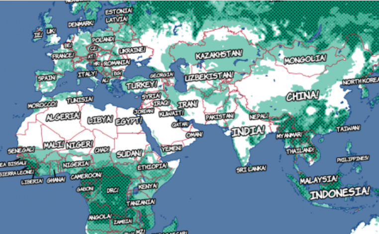
Nervously, I went over and took a look...and this is what I saw:


Now let's be clear, the aim of educating people that the Mercator projection distorts our perception of reality and that Africa as a continent has suffered more than most is commendable. Fighting immappancy (as Krause described this lack of understanding of geography) is also close to my heart. But using maps incorrectly is where I get all cartonerdy.

You'd think, perhaps, that Krause might have taken some of the criticism on the chin and used this update as a way to correct his own immappancy. You'd also think that in a publication that profers the importance of 'science' that accuracy might be important. You also may presume that anything in the 'Graphic Science' section would be scientifically accurate in its visual display. Let's see eh?

Like many, Krause has embraced 3D. People love 3D. It looks cool and literally gives maps depth. So this new graphic is attention grabbing because of it's three dee-iness alone.

However - 3D blocks in perspective wrapped round a globe creates visual distortions. In just the same way that on a flat map that uses Mercator the north and south are distorted relative to the equator, on a virtual globe we see distortions in the relative size and shape of features as they move away from the viewing point - the point closest to us as map readers. China therefore appears predominant and his rendering of Western Europe starts to diminish as it begins to wrap around the curve of the globe. So, visually, comparing like for like from a single point of view on a 3D perspective drawing (or globe) isn't a good way of showing comparisons...particularly when it's based on the relative size of areas (I wrote of these issues in a separate blog).

Notwithstanding the visual problems with interpreting the relative size of shapes across a curved surface, if Krause has at least got all his shapes in proportion during the construction of the graphic then we might at least be able to assume some semblance of relative size. BUT...the sizes and shapes didn't quite look right to me so I popped open my GIS package of choice and played with some shapes.

Given I re-drew the original 2D version I thought it only natural to re-draw the 3D version so here's my attempt at re-making his map with the same countries on a virtual globe:


I had difficulties re-making his map like-for-like for the simple reason that the real world shapes are not the same as he presents. Here's where Krause's map seems to fail:

  • China is not the same shape and has been warped to fit neatly over Madagascar.
  • The contiguous United States is much larger than he presents.
  • Krause included Germany and a partial set of Eastern European countries. There simply isn't room.
  • The real India is larger than Krause represents.

Of course I'm being cartographically pedantic again but if the very thing you purport to show is misrepresenting reality I don't think artistic license is a sufficiently good excuse. Yes, you could argue it's only a little bit wrong but if you're going to do something, why not do it right? Few who look at the new graphic will even think to question its authority and they will glean a distorted picture. That's the real issue.

The world will likely jump on his graphic and proclaim it as a great way to visualize differences in the size of areas. Like his 2D attempt, it's inaccurate. Will anyone care? I do. Should I have made a 3D version? Probably not. The 2D version is far more useful at supporting visual comparison of areas. Adding perspective and extruding the shapes to volumetric blocks just adds unnecessary visual noise that creates problems for our human processing of the map's message.

ht to @cartocalypse for the link

Sunday 7 June 2015

Bend it like Mercator

After their win in the Champions League final yesterday, the 101 Great Goals blog published a piece on the relative location of FC Barcelona's triumvirate of South American strikers. They picked up a map from Reddit that showed their birthplaces as being positioned in such a way that you can draw a perfectly straight line between them on Google Maps.

Here's the map:


A headline writer's dream...arguably the three best strikers in the world all born in formation as well as playing in formation for the world's best team. An easy map to make...take a pen and draw a line across the map to link three red symbols, each of which is about 50 miles in diameter in real world units. Job done.

Except the map is incorrect...which makes the headline potentially incorrect too. A straight line between two places on the globe becomes a curved line when projected using Web Mercator (which the Google Map used by the author is in this case). You cannot simply draw a straight line on the map and infer that it represents a straight line on the curved surface of the globe - because it doesn't.

Here's what the line looks like on a virtual globe as if looking from Messi's birthplace to Neymar's birthplace:


And when we place that line back onto a projected flat map, here's the outcome:


The line now has a slight curve to it but with symbols about 10 miles in diameter it still just nicks the edge of the town where Suarez was born. If I'd used smaller symbols I could have shown the line doesn't pass through Salto, Uruguay. If I'd used big red blobs like the original then of course the line would pass through Salto. Built correctly, we not only get an accurate map...but one that supports the story even better!

OK, we're talking small margins here but the author of the original map got very lucky simply because of the quirk of geography relating to the three players he chose to link on the map. Because the three locations are relatively close to one another (in global terms) and they are also only 30 degrees or so south of the equator we don't see a massive distortion in the line. It has a curve, yes...but only a slight one.

But what if we look at three other footballers? Wayne Rooney was born in Croxteth, Liverpool. Harry Kewell in a Sydney suburb in Australia; and C. V. Pappachan, the famous (?) former Indian footballer born in Thrissur. Here's their map:


As far as I know there is nothing at all to link these three footballers but if we'd taken the mapping approach used to link Barcelona's strikers we'd also get a perfect straight line passing from Liverpool in the UK, all the way to Sydney, Australia via Thrissur on the southern tip of India.

If you got in a plane and flew the straight line route between the UK and Sydney the closest you get to Thrissur is about 2,500 miles. The red line shows the planar version of a straight line projected on Web Mercator. I included the Barcelona striker's line for scale which shows that smaller distances, particularly near the equator, 'appear' less curvier.

News aggregators, blogs and, well, pretty much anyone should question maps. They lie. They are terrible at telling porkies. Worse. Most map readers don't know they're being fed a lie because they look authoritative; and they don't know that the maker of the map they're looking at didn't know the pitfalls of their approach either.

As it turns out, Barça's strikers do happen to have been born close enough to almost lie in a straight line on the globe and on the map. The curve on the projected map tells the accurate story. Try telling the story using three other footballers who appear to have been born along a straight line on a map and chances are, they weren't.

Hat Tip to Brian Timoney for the tweet about this map.

Saturday 6 June 2015

Colour me bad

Cartographers have often been accused of doing little more than drawing lines and colouring in. It's a rather negative and stereotyped perception that fails to acknowledge the many different aspects of the job of making a map or indeed, to what purpose the map design is intended to support.

I've therefore become concerned at the growing trend of maps that appear to be created simply to showcase, how do I put it, drawing lines and colouring in. Most of us probably had paint-by-numbers kits as kids but we grew up and started with a blank canvas which was far more challenging but ultimately, more rewarding. Cartography has regressed to paint-by-numbers. People no longer start with an empty canvas. Having the data and colouring in tools is so useful in so many ways but for far too many it's just an excuse to do some mapping by numbers. We're not being stretched to think about the map any more. We're simply putting together component pieces from others and painting them in different ways.

Take the following examples which have garnered much love on the interwebs. I'm deliberately not naming the authors and I have no particular issue with the end products because on the whole, aesthetically, they work as pieces of art. But do they work as maps? I think they're illustrative of a paint-by-numbers craze in modern cartography.


One of the major requirements for a map has always been base data to give context, situate our own data or simply to indicate the pattern that humans make on the natural landscape. Over the past few years acquiring base topographic data has become ridiculously easy through the many open and paid-for suppliers that exist. Many of these come pre-styled into designs that support a variety of uses. Many of them can be re-styled using a number of different approaches. The processes of data collection, processing and generalisation are largely ignored by today's modern map-maker. Instead, they simply regurgitate other people's data and re-style to distinguish their map from everyone else's maps. The maps above then leave it at that. They go no further and they offer no clue as to what their eventual purpose might be other than as an example of painting data.

The result of all of this artistic expression is simply that we're seeing an awful lot of re-styled versions of the same data. They are painted maps in their own right but what function do they support beyond that? They appear to exclaim that form is the end-goal and function is all but forgotten. Pretty yes, but none of the maps you see above can really be used for anything purposeful. The balance between figure and ground is so often forgotten in many of these re-styled maps as well..and the typography is often poorly integrated. Putting our own data on top of them would be pure folly.

The maps are fun it’s true. But is the exercise of colouring in data doing anything to enrich cartography? In its simplest form we're using freely available vector data, popular and widely available design and production environments and then, well, changing the colours of the vectors. What does this prove? It proves we're able to find the RGB values of some inspirational art or colour schemes from nature and then change the map data accordingly. This is nothing more than buttonology – a longstanding issue, debate and criticism of digital cartography and geo-technology in general. We're losing our ability to understand the structure of the data in a cartographic sense or to wrestle with it in conjunction with typographic elements, layout or thematic overlays. We're losing our understanding of cartography.

Of course, we've been conditioned to accept that a pre-styled base map is adequate for making maps. How many maps do you see where someone puts a choropleth on top of a topographic basemap for instance? Using topographic, or reference, base maps just makes no sense for thematic cartography but it's an easy solution because it requires no effort. Actually, getting the balance between base and theme, ground and figure does require effort and should be part of our concern as cartographers. Effort is required. Effort should be rewarded but I see far too many of these painted maps get accolades they scarcely deserve.

Painted maps tend to show little cartographic quality. The re-painting of the data only illustrates the map-maker's ability to use a piece of software. There's no real generalisation of the data; selection of data or omission of clutter. There's hardly any graphical hierarchy built in to the map or emphasis on how colours interplay between symbols or across the map. Random features get symbolised in bizarre ways simply because the data exists so it should be coloured. How could the lines be simplified or exaggerated to the extreme but still give us a sense of the map? How might clarity or legibility be changed and to what extent? Is it possible to invert the data in a visual sense or play with the layout in ways the riff off approaches in art more generally? And what happens when you zoom in or out of the map...does the style update as the data is progressively generalized or modified at different scales? Rarely does any of this happen. We simple get more of it at larger scales but there's little nuance to the way the data is portrayed.

A lot of art deconstructs images and objects. Think of how Warhol approached bananas or a tin of Campbell’s soup or a picture of Marilyn Monroe. His art was to express the figure of his work in a new, different way. Re-colouring data on a map doesn't go far enough. It doesn't show any sense of design acumen. Maybe I'm just getting bored of all the so-called re-imaginations of map data but where is the originality? Where is the expression? Where is the cartography?

It's always nice to play around with maps and experiment (I do it all the time) but at some point we've got to go beyond being seduced by the technology and get back to understanding of the map and the relationship between aesthetics, form and function. Learning to change the appearance of symbols is good. Goofy and experimental mapping is also good. 'Goofy and thinky' is, to quote Hannah Fairfield (of the New York Times at OpenVis 2015), far better.

It’s the thinky bit that I feel is missing from this type of work and that the seduction of being able to use the data and do something to it relatively easily is what counts for many. Over the last ten years or so, the shift in time from having to collect and process all this data before you can even get to styling it has been profound. Someone’s done all the hard work. Actually, millions of people have done the hard work. Isn’t it incumbent on us to honour this work and take it further than simply painting it?


I think this sort of work might be generally called inconsequential cartography. I’d like to see more consequential cartography. I’m all for playing with the map in artistic ways but take it further. Make a statement. Make it say something. Make it work in concert with some other data to create a map, rather than just changing the basemap. Give it a real purpose. Give it a context. Marry the playful form with a function.