The
Bomb Sight project recently went live, presenting the London WWII bomb census between 7.10.1940 and 6.6.1941. It's a terrific effort (kudos to the team), cataloging anti-invasions sites, bomb types and adding an overlay of the bomb maps themselves. The map is the result of a year's worth of work which hints at the effort needed to build an interactive web map with good quality content...it's not a trivial task! Just a few words on the cartography...
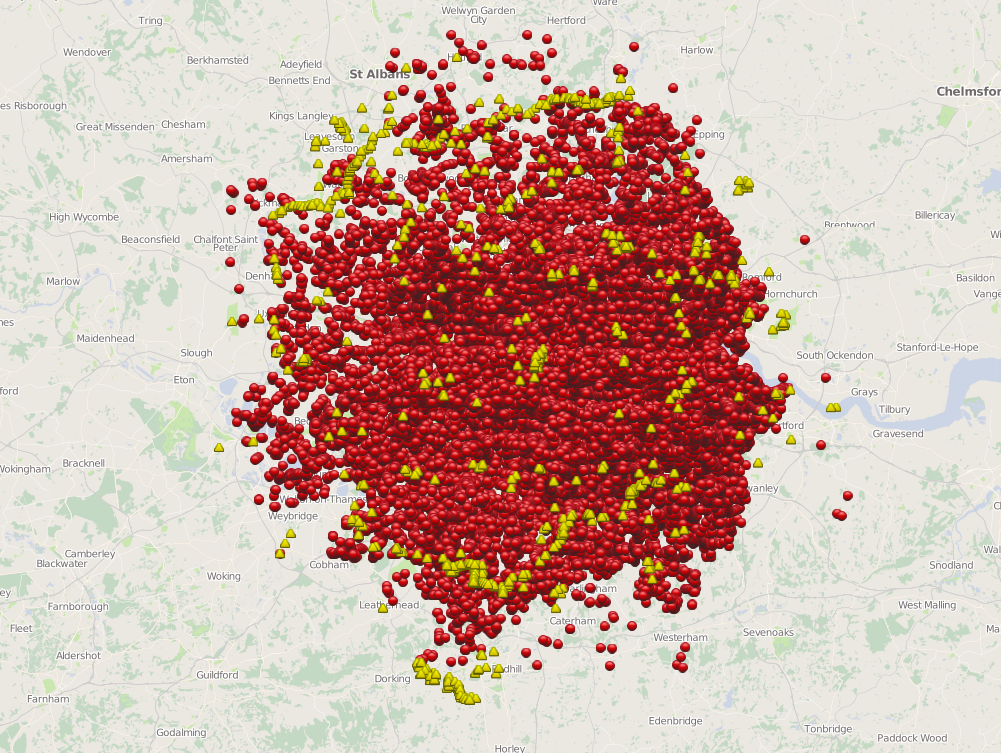
Given the sheer magnitude of the number of bombs at scales smaller than about 1:72k the map descends into an inevitable push-pin madness. Now I can understand the point of this is perhaps to create a stunning visual impact of the sheer scale of bombing (and the word Blitz has never been more appropriately illustrated) but there are more useful ways to present the data. Binning into geometric shapes (hexagons, squares) would create a summary overlay. Some form of interpolated surface might also summarize the data better at these smaller scales. The scales could, of course, be constrained to avoid the map being able to zoom out too far. I'm in two minds over this...it's probably the only example of data which isn't fundamentally destroyed by the amorphous blob of overlapping symbols simply because of the subject matter. Certainly, the scale of the Blitz is illustrated with a frighting clarity even though, technically, clarity is not usually supported by push-pin overload.
 |
| Bomb sight map at 1:577k |
At 1:72k even though there isn't interactivity it's fascinating to see the patterns of bombing runs (clearly seen in the screen grab below). It might be nice to code the symbols somehow to indicate they were part of a single run (perhaps a thin line to join related dots)....possibly at scales 1:36k and larger.
 |
| Bomb sight map at 1:72k |
Zooming in further, the contrast between the subtle basemap and symbols is well crafted. When you zoom to the largest scales (1:4k) the symbols change from generic geometric shapes to pictorial designs and multiple bombs at a single site are presented as numerical markers that literally explode into component parts when clicked to reveal individual sites. At 1:4k the map now allows interaction with each symbol containing a popup with basic details and a link to much more detailed information. The map works really well at these scales but I'd like to have seen interactivity developed at smaller scales. Given people's propensity to move away from web sites rapidly, it would be useful to incorporate interaction earlier to avoid them leaving the site before the good stuff....I found myself clicking around at smaller scales to prompt some form of interaction which is only rewarded once you have reached 1:4k.
 |
| Bomb sight map at 1:4k |
There's some useful filters in terms of layers you can switch on or off and you can isolate the first night of the Blitz with a nice bar graph. The ability to search by neighbourhood, view other statistics and ancillary information, images etc is a great way to support alternative forms of inquiry and further mining of the information. The cartography could have supported the interaction further though. The popups could present the date as well as the place. The data clearly has a temporal component so it shouldn't have been too difficult to provide a time slider allowing users to cycle through by date, or even play an animated version. The Android app version adds in functionality to use the phone's location to zoom to the local area and an augmented reality mode that supports the overlay of bomb details as you wander round. Neat!
Overall a really great example of how a web map can be used as a portal to archive material and how the map is part of the overall presentation which works well when you have a rich dataset. In my opinion, some tweaking of the cartography would help...not to make it 'pretty' but to summarize the data better at certain scales and make the map more effective across scales rather than only at larger scales. The point here is really to emphasise that a multiscale web map is really a series of individual maps that has to function at each scale. The bomb sight map works brilliantly at some, but less so at others which impacts on the consistency of the user experience across scales. Building a multiscale web map requires careful planning of each scale along with a clear idea of the transition of data representation, symbol design and interactivity across scales. There aren't many that get the balance right but this web map is certainly one of the better examples.